Have you ever paused to think how the dominant colour stories of each era reflect cultural moods, technologies, and social change? Just as we have previously dives into the meaning behind a hex code for Christmas red, this post steps back to survey how trends in colour evolve — and peers ahead to what’s trending in 2025.
| Era / Decade | Dominant Colour Mood & Themes |
| 1920s–30s | Deep, lush jewel tones — emeralds, purples, rich black accents |
| 1940s | Sturdier, patriotic basics: deep blues, reds, neutrals |
| 1950s | Pastel sensibility — mint greens, baby blues, soft pinks, peaches |
| 1960s | Bold, punchy colours — acid greens, oranges, magentas |
| 1970s | Earthy, organic tones — avocado, harvest gold, burnt orange, rich browns |
| 1980s | Neon brights, electric contrast, maximalism |
| 1990s | Muted neutrals, soft pastels, minimalism |
| 2000s to 2010s | Technology-influenced palettes, “millennial pink,” flat design, accent brights |
| 2020s (so far) | A tension between warm neutrals, earth tones, and expressive accents |
Over time, the pendulum swings between bold statement and subdued calm. At times colour is exuberant, expressive, even aggressive; at others, it’s soothing, muted, restful. The present moment seems to favour a blending of both — expressive accent colours anchored by earthy, comforting neutrals.
2025: Comfort Meets Confidence
After years of uncertainty and digital overload, 2025’s colour story is one of reconnection. Designers are reaching for shades that feel real — colours inspired by earth, sky, and touchable materials.
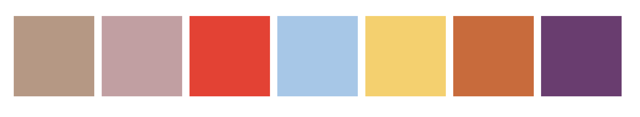
The Pantone Colour Trend for 2025, Mocha Mousse, captures that perfectly: warm, comforting, yet grounded. It pairs beautifully with both soft pastels and rich, romantic hues.
| Colour | Mood | Suggested HEX |
|---|---|---|
| Mocha Mousse | Calm, grounded, tactile | #B59884 |
| Dusty Rose | Soft, romantic, nostalgic | #C19FA2 |
| Tomato Red | Bold, confident, energising | #E34234 |
| Sky Blue | Airy, refreshing, digital yet natural | #A7C7E7 |
| Butter Yellow | Optimistic, cheerful, sunlit | #F4D06F |
| Terracotta Clay | Earthy, authentic, handcrafted | #C86B3C |
| Plum Violet | Sophisticated, creative, introspective | #693D6F |
The Most Popular Colour Combination in 2025
Dusty Rose + Tomato Red
This unlikely pairing is stealing the spotlight across fashion, interiors, and branding. It’s the perfect marriage of softness and strength — romantic but modern.
To make it work:
- Use Dusty Rose (#C19FA2) as your base.
- Add Tomato Red (#E34234) for highlights, text, or focal elements.
- Anchor with a neutral like Mocha Mousse (#B59884) for a cohesive balance.
It’s playful, unexpected, and full of energy — exactly what 2025 is craving.
Other Trending Colour Pairings
- Camel + Sky Blue — warm and cool harmony (
#C9A07E+#A7C7E7) - Terracotta + Off-White — rustic meets minimal (
#C86B3C+#FAF7F0) - Butter Yellow + Charcoal Black — sunshine meets strength (
#F4D06F+#1F1F1F) - Mocha + Muted Plum — cosy and elegant (
#B59884+#693D6F) - Cherry Red + Soft Blue — a nostalgic revival with a modern edge (
#C0392B+#8EBBD6)
These palettes reflect a broader cultural trend — combining grounded, nature-inspired tones with one bold, emotional accent.
What’s Driving These Colour Shifts?
1. Sustainability & Nature
People want colours that feel rooted — hues that evoke soil, wood, stone, and sun. They bring calm to fast digital lives.

2. Digital Softness
After years of flat, saturated digital tones, softer gradients and “touchable” colours have taken over design platforms and social media.

3. Emotional Design
Consumers now choose colours that make them feel something — warmth, comfort, hope, nostalgia. That’s why muted reds, browns, and pastels are dominating.

4. Nostalgia + Modernity
Many 2025 palettes borrow from vintage schemes (think 1970s terracotta or 1990s beige) but update them with sleek modern finishes.
Many of these colours can be found, and in agreement with, Trendstefan.


Looking Ahead: What’s Next?
If current trends continue, 2026 could see:
- A stronger move toward yellow-based neutrals instead of whites.
- Textural colour design — matte, chalky, and layered tones.
- A continued love for “earth meets energy” pairings: soft browns with radiant reds or blues.
Designers and homeowners alike are embracing imperfection — palettes that feel handmade and heartfelt, rather than overly polished.
So What’s going to be your favourite this year?
Just as Christmas Red has its own story — from festive warmth to cultural symbolism — every trending hue in 2025 tells a tale of how we live now: more grounded, more emotional, and beautifully human.
Whether you’re designing a brand palette, decorating a space, or just exploring your creative side, don’t be afraid to mix soft comfort with bold expression. That contrast is what makes modern design sing.