When someone asked me about my peanut branding they were surprised to learn I don’t actually like pink.
Recently I have had a discussion with someone who complimented my Peanut branding (first time for everything and I think I actually shed a happy tear) but this person was surprised to learn that I pink isn’t one of my personal favourite colours; I would never wear it…that was until very recently when I started to wear my Peanut Merch.
Colour is a powerful key when decided about your branding colour palette and what will be your dominant colour.
Red represents love, passion and warmth but also danger, warning and the extreme.
Green represents nature, renewal, health, growth and tranquillity.
Blue represent calm, trust, responsibility, harmony and peace.
Purples represents loyalty, luxury, power and ambition.
Yellow represents happiness, joy, energy, friendship and hope.
Orange represents earth, change, strength, creativity and enthusiasm.
So what about pink…
When I was doing research into the theology of colour one thing stood out to me and I immediately knew that PINK was the right colour…but before I tell you about that let us first thing about colour variations.
Variations in colour are key
As you will know there isn’t just blue, for example, there are lots of different shades – dark blues and light blue, turquoise blues and sea blues, sky blues and midnight blues – and each one represents a different emotions and in turn produces a different emotional reaction in our potential customers or clients.
Choosing the right shade is just as important as choosing the right colour.
Pink has so many different shades and most of my life I haven’t been a big fan of any, but as I researched it’s meaning I found myself being convinced that this was the right colour for Peanut .
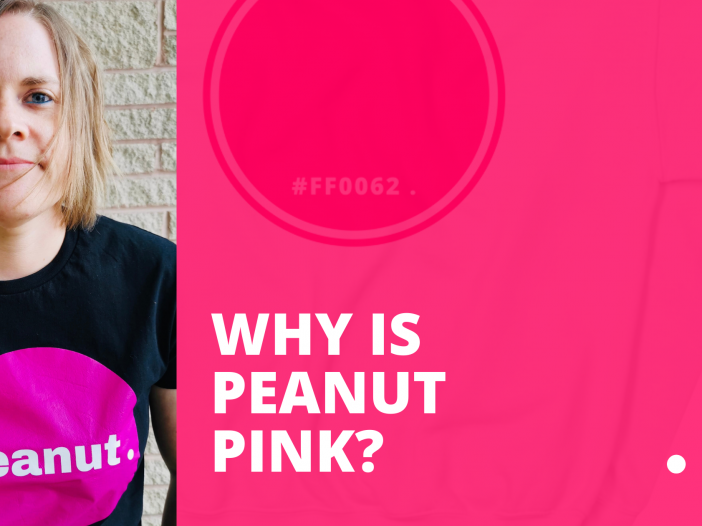
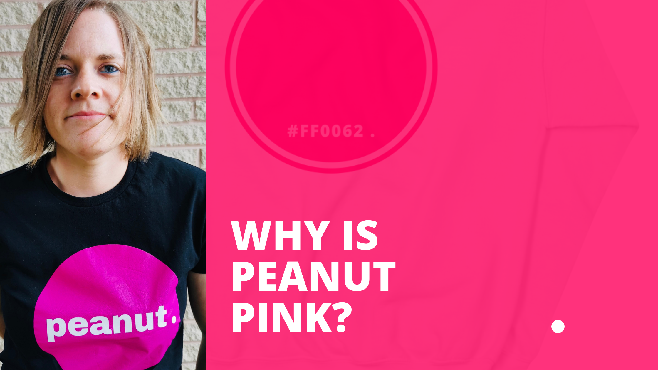
One of my personal favourites is dusty pink, hex code #DA8695, but I felt it was a bit washed out for Peanut . so I moved over to cerise pink – initially I thought it was to bright, but as I moved through the shades I landed at #ff0062. This was the right kind of boldness I was after and I even surprised myself as to how much I love it now.
Back to the start
As I was saying, when doing research one person remarked that a warm, enticing and happy pink such as the one I have chosen for Peanut . represents peace, approachability, clarity, laughter, fun and strength.
But the one word that stood out to me about pink was that it also represents KINDNESS and this is the reasons I chose it.
One of my own mantras is “Do today with kindness” and it is my aim through my life and also my work to spread kindness around to the best of my ability; to be kind to those who need it, to be kind to those who have less and to be kind with my words when speaking to a client about how we work together.
My mission is to take the fear and frustration out of designing and turn it into the start of a new adventure – I intend to do this through kindness!
So why is Peanut . pink? Because I choose to be kind!
Find out more about Peanut Designs or Laura Murray