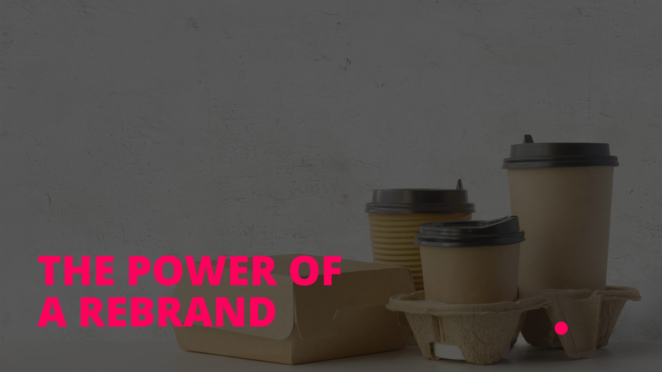
In recent weeks, Burger King and McDonald’s, two of the largest fast food restaurants, have released a rebrand of their logo or point of sale and product design.
Burger King was founded in Florida in 1953 with a black and white sunshine logo, but it wasn’t long before colour took over as they headed into the 60’s with a character based logo. By the 1970’s the familiar and well loved burger bun in orange and red was born and since the 70’s this, in some form, has been the brand that Burger King have stuck with.
McDonald’s on the other hand, began in the 1940’s with a black and white text based logo but again, by the 1960’s had landed a colour logo and the famous ‘M’ was born. Always seemingly ahead of the curve, McDonald’s famous M is a well known, and well loved brand world wide and even my own kids, from a very young ages, recognised the red and yellow sign from a great distance.
For both fast food places, packaging is a huge part of their brand and here is where we find ourselves today as both Burger King and McDonald’s have reverted to a simple illustrated design with vibrance, brightness and simplicity that customers can appreciate. They have both got rid of a lot of unnecessary noise that in this new era, post covid, people need!
Burger King’s rebrand goes Old School
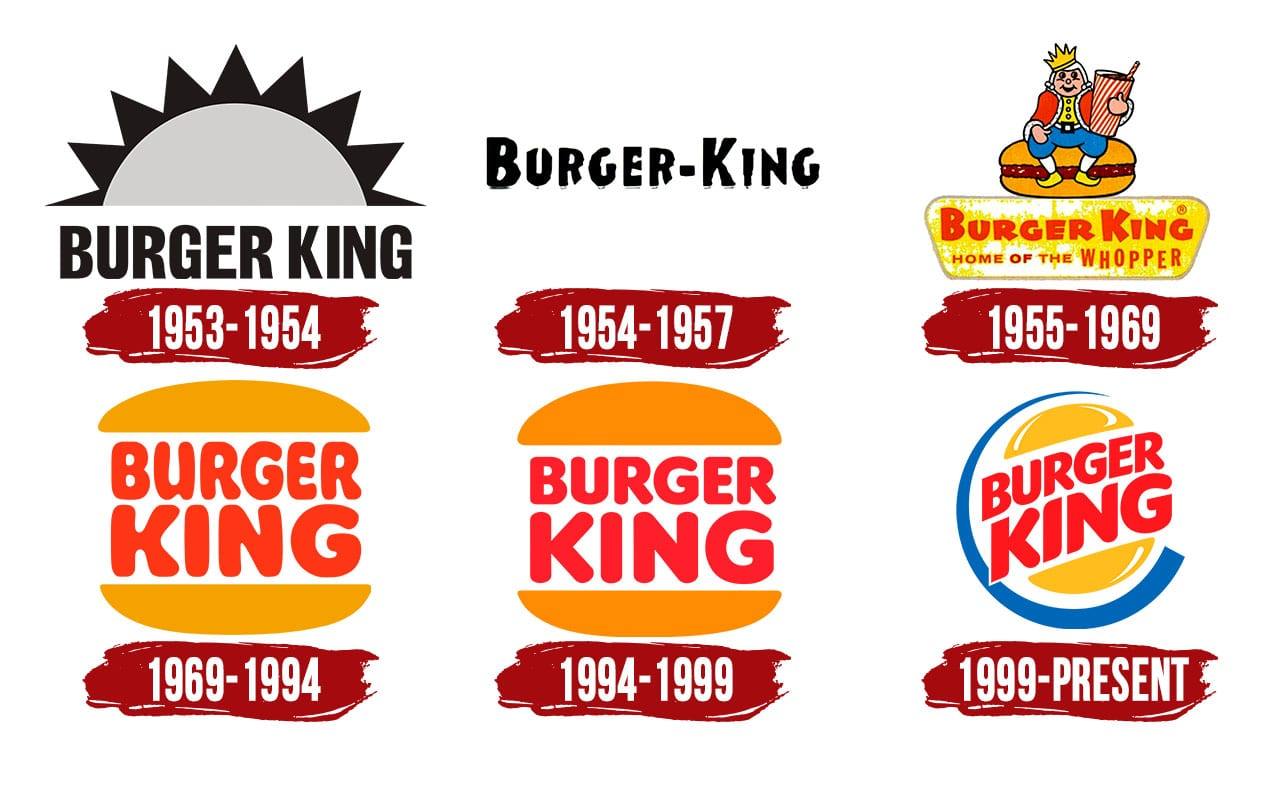
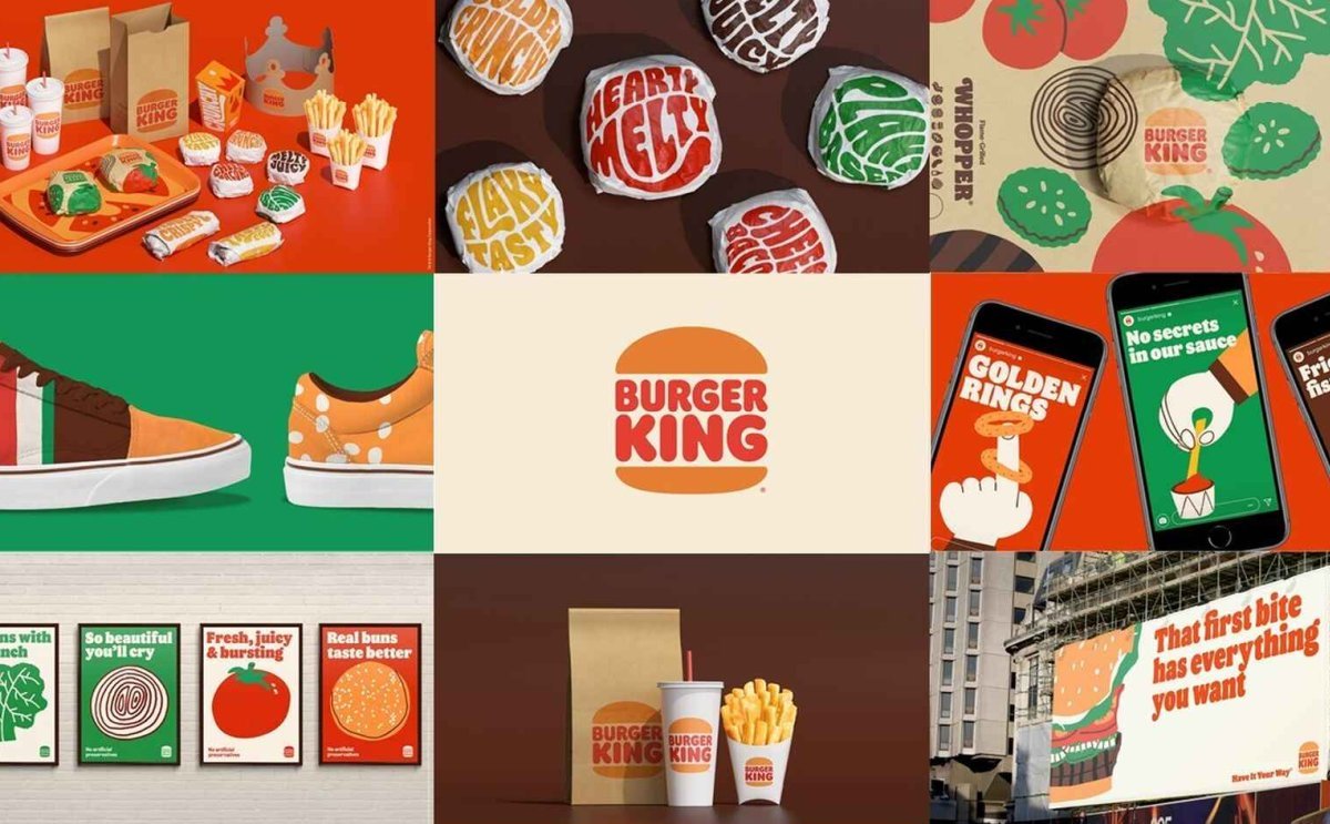
Burger King have entered in a full visual rebrand, that has sparked some serious interest and on the whole has received excellent feedback and has had a positive impact on the design industry. Some have described it as minimal, but in this day and age, minimal is what sells, complicated just creates anxiety and stress; we need clean, simple lines, simple colour palettes that create a calming experience. Their font choice goes right back to the flower power, Austin Powers feel but without the flowers, taking their brand back to their roots in the 60’s.
A well thought out rebrand. I love it.
McDonalds’ rebrand brings the colour
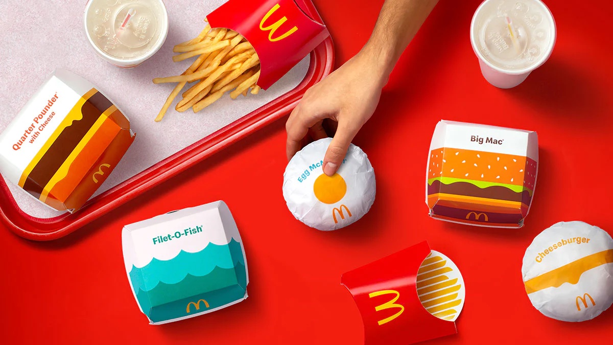
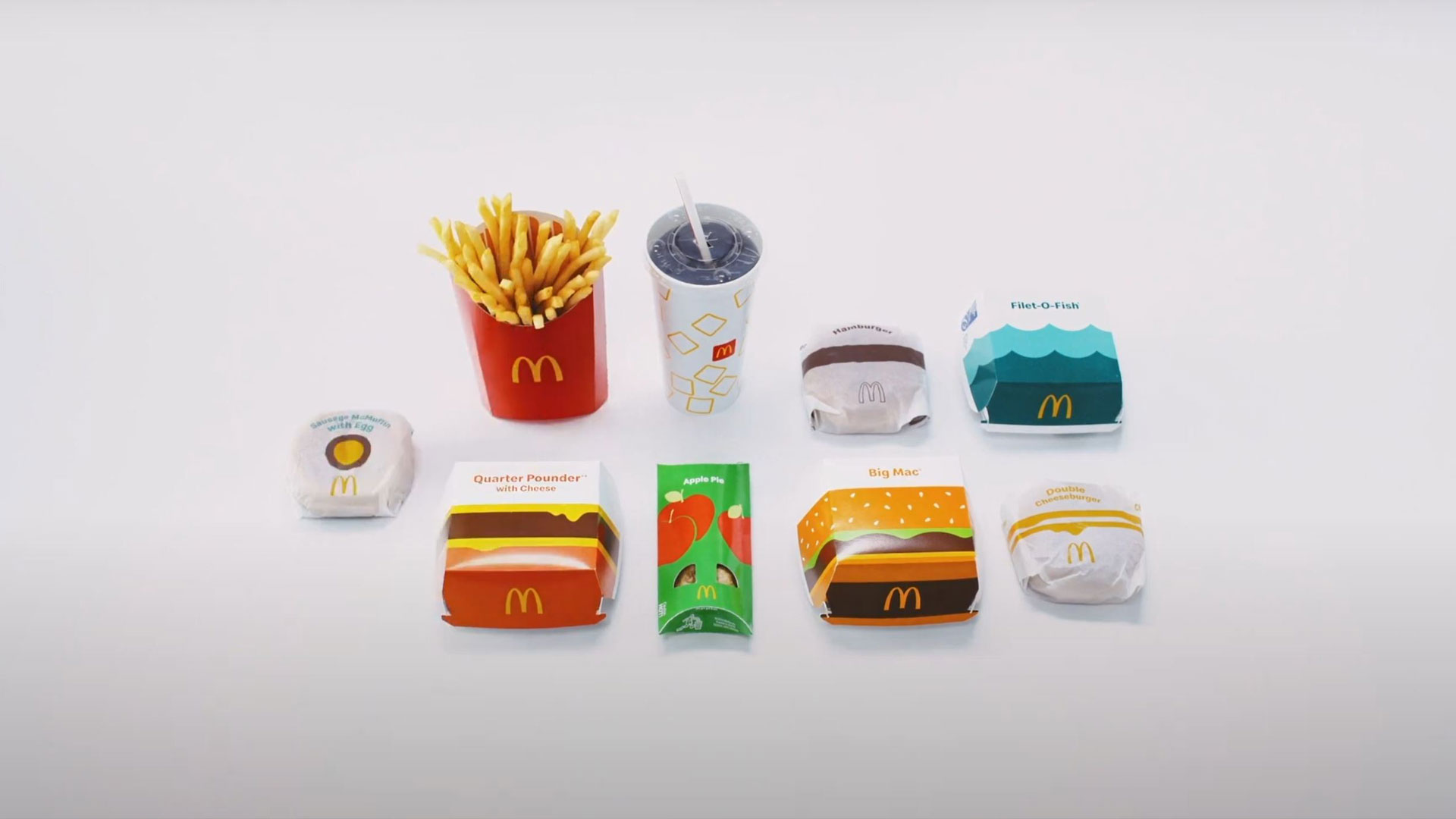
Design Week writes, McDonalds have tested a new drive-thru concepts with a streamlined packaging design, ordering through their app, and making a COVID safe interaction. But their packaging needed a touch up! They have refocused their carbon footprint and are aiming to get rid of all plastic by 2025. New cup holds, thinner lids, paper straws (you know how we all hated those things once…!)
But the best part of their rebranded packaging is the simplicity. Again, in this post covid era, we need simple designs, white space has never been more critical to induce a calming environment, and McDonald’s have nailed it. Beautiful lines, curves, bringing to life their burgers in a flat form that is recognisable and looks good enough to eat. They have taken off the fussy writing that clogged up their packaging, and just given us the headlines.
So what’s in the future for packaging design?
Well that’s for the world to decide. But here’s what we have learnt:
- Simple is best.
- Give us space, white space, lots of it.
- Clean up your designs.
- Simplify your fonts and colour palettes.
As an illustrator and creative designer, I get excited when I see the BIG boys not being afraid to rebrand their customer facing aspects. More than ever we need the big players in their industries to focus their branding on its customer who are desperate to engage but want to know that you still need, want and love them.
This rebrand goes for ALL businesses and industries from fast food restaurants to hospitals, churches to clothing brands. Refocus, Rebrand, Reimagine the future.
Other posts
Design is important… [read more]