
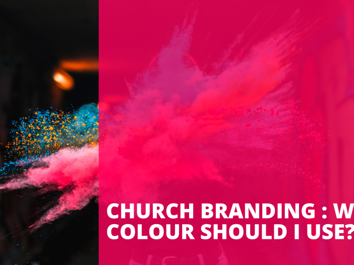
Church Branding : What colour should I use?

“Black, on black, on black is definitely the best branding for churches.” – quote from social media group.
Again, here tackling a very common question among churches on a budget, churches looking to rebrand or looking for a freshening up of their church designs, logo and branding…”WHICH COLOURS HAVE YOU FOUND MOST EFFECTIVE IN CHURCH BRANDING?” was another question on a social media group board that I found really interesting, again not just because it’s a common question but because of the very basic answers people gave.
- Black is best. Put black shades on black shades. Keep it simple.
- Blue for sure.
- “Blues. Greens. Blacks Whites.”
As I said in my previous blog, this is extremely harmful to an unprofessional who doesn’t understand the full extent of design, the power of colour and also how to develop a logo and branding properly. Not trying to be harsh or unhelpful. Just stating facts. But rest assured. I am here to help!
What colour should I choose?
Firstly, all branding, logos and designs need to work in black and white. So if you are designing a logo that relies heavily on specific colours, you immediately restrict it’s usability in the future. Colour is a great tool and can enhance a design, however when it comes to a logo, icon or mark for any church or business or enterprise, think carefully about making it clear and making it simple. If the logo doesn’t work in black and white then go back to the drawing board.
Secondly, we need to understand how colours work and what they represent. This blog will help you to understand this further; but in short – let’s consider some colours.
It would be worth noting that the remarks about blue is interesting. It’s a very common colour and on the whole is the top favourite colour of people all around the world.
“Dark blue: trust, dignity, intelligence, authority
Bright blue: cleanliness, strength, dependability, coolness
Light (sky) blue: peace, serenity, ethereal, spiritual, infinity
Most blues convey a sense of trust, loyalty, cleanliness, and understanding. On the other hand, blue evolved as symbol of depression in some cultures. “Singing the blues” and feeling blue” are good examples of the complexity of color symbolism and how it has been evolved in different cultures.”
So the question here is – is blue the correct representation of your church, your values, your culture and is it going to send the correct message to people who see your branding? Only you can answer that question.
Let’s quickly look at other top colour choices.
Red: passionate love, seduction, violence, danger, anger, and adventure.
Yellow: happiness, and optimism, of enlightenment and creativity, sunshine and spring.
Green: growth, rebirth, luck, nature, envy, and fertility.
Purple: dignity, wealth, royalty, romance, creativity and loyalty.
Orange: good health, vitality, communion, friendship, excitement, joy and warmth.
Don’t forget about variety.
We can all imagine these basic colours in our minds when reading or talking about them but let’s not forget about shades. There are so many shades in the spectrum of all these colours and each one provokes a thought, a feeling, an emotion – something you also need to consider – how does one feel when looking at your logo/branding?
Partnering Colours.
And then lastly, partnering colours together. I highly recommend this website in order to explore a workable colour palette. What is a colour palette I hear you say? This is a mixture of between 3 + colours that set your branding – they can be a mixture of different shades of the same colour or a mixture of colours that really work and blend well together.
Here are some examples that I got from this website:


You don’t need to use all 6 colours, you might find just 2,3 or 4 colours you like that work well together. But this website will open up your eyes to look at the different varieties, shades, tones and mixtures of colours that could be available to you.
There’s no limits.
I guess what I am trying to say is that just saying “Black on black” or “Blue for sure” is just really narrow minded, expresses no thought towards you, your culture, your people, your DNA and who you are as a church. So it’s time to dig a little deeper, use the tools that are available to you and see how far your imagination can take you. and remember – it must also work in black and white.