Over recent years I am discovering how important colour is when I am designing. Colour is EVERYTHING in design. When to use it. When not to use it. What specific colour to use.
I know what you’re thinking “wow, she can’t be any good if she’s had years experience and has only just figured this out” Well hang in there with me. There’s a story here.
My son, who will be 2 in October, sent my senses crazy during in pregnancy. I was working on a website that had some very vibrant colours; burnt orange, lime green, cyan and magenta with black and white. I was going through pregnancy sickness whilst designing and these colours had a really big effect on me and would trigger more sickness. Following the birth of my son I thought that much of what I had felt during pregnancy would subside and disappear and things like colour wouldn’t effect me, but it has just not been the case, and I still can’t look at the website I was working on without feeling sick.
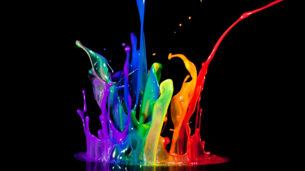
Colour effects people in so many different ways, they have a great effect on our emotions, our memories, our sight and our physical reactions. Some people are colour blind of see one colour as a different colour. So how do we then approach and plan our design with these factors in mind…
Well, if I’m honest, we can’t.
- Our clients often control our outcomes so we kind of just have to either go with “client knows best” or use our wise powers of professional persuasion to encourage them onto the path of true colour magic.
- We often go through times when certain colours are floating our boats more than others, and lots of our design work in corporates these colours…go on, admit it, we’ve all done it
But what we can do is be influential and intentional with the colours we are choosing. Knowing the basics is critical.
Taken from Colour Matters ‘Basic Colour Theory‘, they say “…harmony is something that is pleasing to the eye. It engages the viewer and it creates an inner sense of order…when something is not harmonious, it’s either boring or chaotic. At one extreme is a visual experience that is so bland that the viewer is not engaged. The human brain will reject under-stimulating information. At the other extreme is a visual experience that is so overdone, so chaotic that the viewer can’t stand to look at it. The human brain rejects what it can not organize, what it can not understand. The visual task requires that we present a logical structure. Color harmony delivers visual interest and a sense of order.”
Smashing Magazine also adds “Color in design is very subjective. What evokes one reaction in one person may evoke a very different reaction in somone else.” (check out their full article about colour & design for more inspiration here)
Primary Colours
Red means danger but it also means love, in design it is often associated with sport, news and a slick modern corporate feel.
Blue means responsible, calmness but also sadness, often used in web, technology & science themes.
Yellow means brightness, happiness, energy but also cowardice, often used with food, children, nature and rock music (with black/grey).
So…
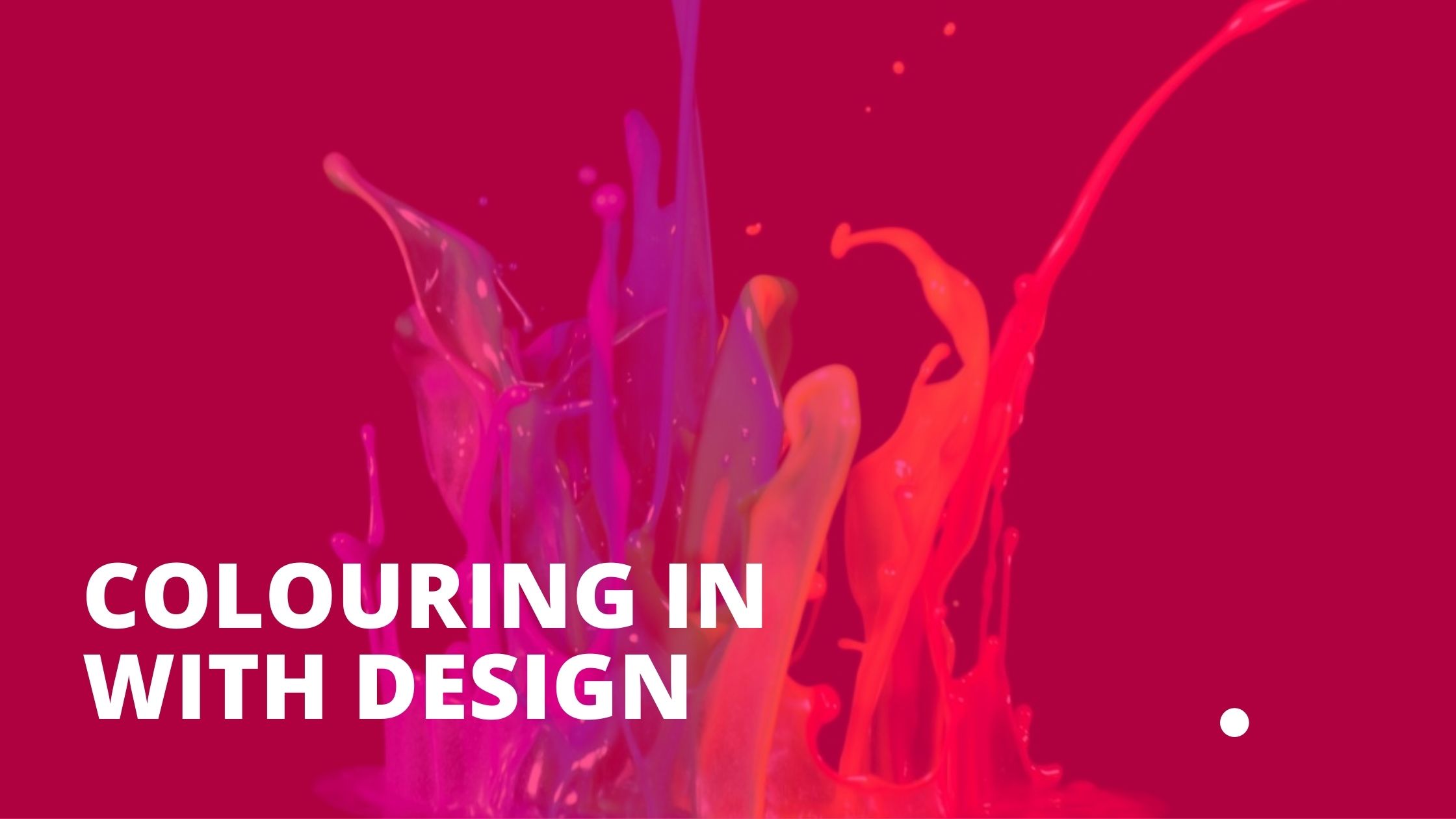
“Colouring in” with your design is all about your choices and what you want to provoke, imply or visually express, so choose wisely.