
Book Cover Design Tips
So you’ve written a book, had it formatted, it’s ready to go for publishing but now you need a cover….but where do you start? To be honest, this is probably the bit you’ve thought most about, and for some first time authors you have a million ideas or none at all. This blog is here to help you!
Firstly let’s clear up something, book covers do not have RULES but they do have NEEDS
NEEDS:
- Your cover needs a title and an author name.
- Your cover needs a blurb on the back to tell people what your books about, a title-bit or a suspense paragraph to entice readers.
- Your cover needs a bar code – provided by the publisher.
All other information is subjective to you, the author, and you can decide what else you want to do add
ADDS:
- You might want to add an author picture and short biography to the back of the cover
- You might want to include a price if you plan to sell them in person or in a book store.
- You might want to include logos and website links to people who helped you publish or to anyone/anything you are associated with
NO RULES
So why do I say that a book cover has no rules? In the same way any piece of art provokes a persons emotions differently to the next person, a book cover will do the same thing. In its simplest form, a book cover is in fact a piece of art.
Observe, if you will, The Lord of The Rings by JRR Tolkien. When he wrote the Fellowship of the Ring published it in 1954, there were no such thing as photography or photoshopped covers…it was all illustration based, and probably quite revolutionary for it’s time.
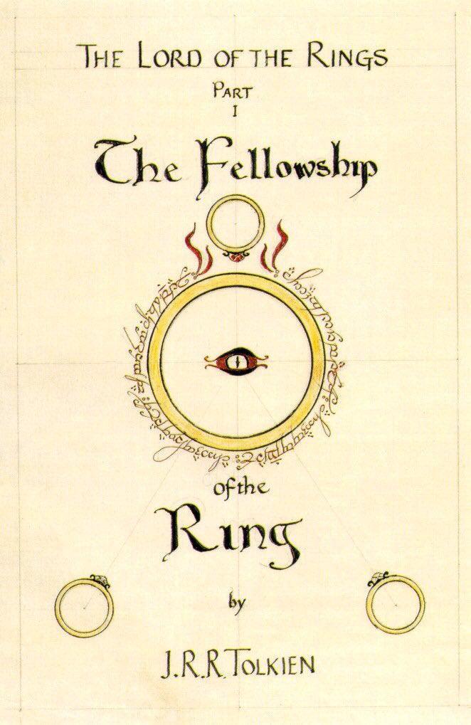
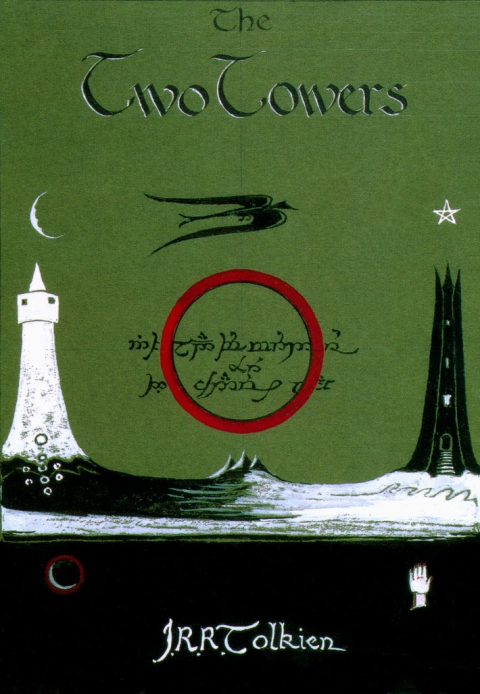
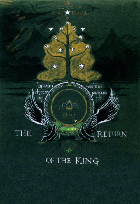
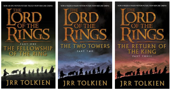
Now, moving forward it’s very popular to have ornate designs, almost 3D, lifelike cover designs, especially with the introduction of the films that were made – this brought a whole new dynamic to book cover design for this particular example.
However this does not change or effect the content within, but a different book cover may appeal to one person more than the other. This should not be something you need to be scared of but you should see this as a positive; you can express yourself completely and fully with your cover.
What styles?
- Plain – a plain cover could be just what you need, you let the title and the typography do the talking and leave people guessing and wanting to know more because you kept it simple.
- Illustration – this could be simple illustration or a full illustrated cover. And illustration has so many different avenues and angles. This is exciting and can add character flair, depth and adventure to your cover.
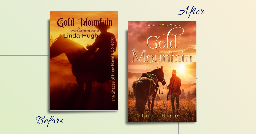
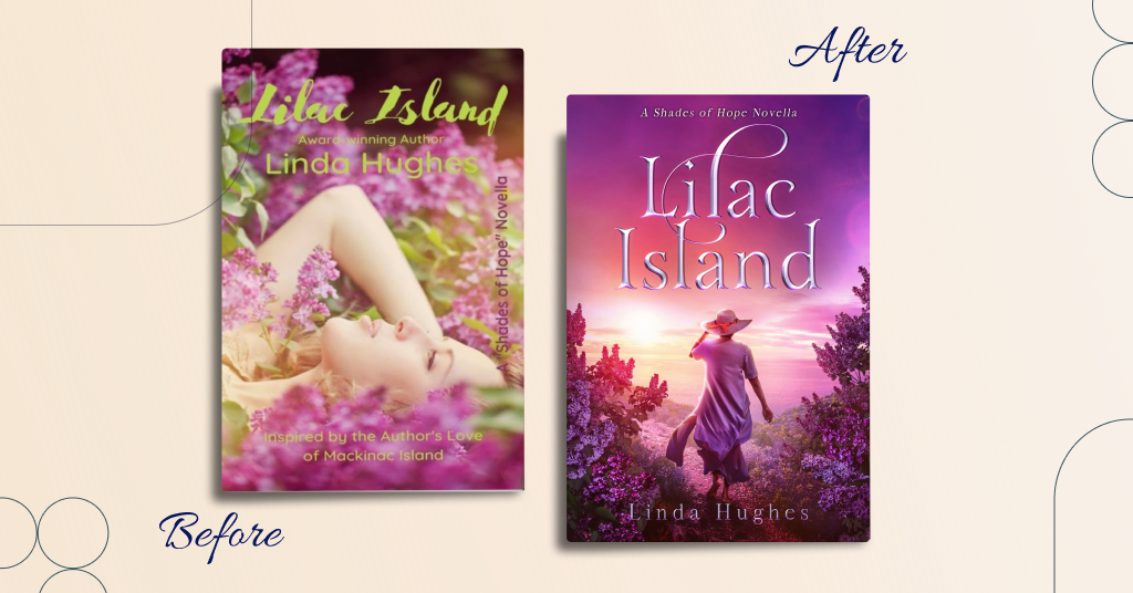
- Photography – the most popular of design styles is probably a cover based on photography; whether that be one photo that you have taken or that you have found that can span or be extended to cover the whole cover (front & back) or one you find online to purchase with the same purpose. Or even one that is manipulated and designed by a cover designer that overlaps elements, characters, figures and text to create suspense, a more graphical look inside the content of your book and can give the book a realistic feel for a reader.
These are just a few ideas; but no doubt you will find more.
Fonts
The last thing to mention is font choices. The fonts – or more professionally speaking “typography” you choose can make or break a book cover and can turn a designer role into a dream or a nightmare.
I have already said that a book cover can be and will be subjective, however you can also influence your reader by the typography choice and placement.
Be wise to choose fonts which are easy to read, that aren’t obstructive to the cover (unless intentional) and that enhances the cover and not deters it.
Although I say subjective, here are some examples of bad covers based on typography that I, subjectively, don’t like.
Here are some example from Miblart:
Final thoughts
If you choose to go ahead and design your book cover yourself then I’d encourage you to read this blog carefully a few times, research your target market, look for similar books and try not to be smart by designing something “totally different” because you want to “stand out”; this is unlikely to be successful. Be intentional, know your audience and stick to your guns and these tips.
Alternatively, I highly encourage you to seek advice, help and maybe even get a professional involved in your project, you won’t regret it.
HAPPY DESIGNING. HAPPY PUBLISHING.
GOOD LUCK with your book!